
Overview
Pardin Banking App originally the collective banking app was re-created for the purpose of linking other Nigerian banks debit card into one app all in one place. I also wanted to practice building a clean and intuitive digital banking experience while improving my skills in UI layout, typography, and accessibility.
Problem
Managing finances across multiple Nigerian banks can be frustrating for users who own several debit cards. Most existing banking apps only support their own bank, forcing users to constantly switch between apps to view balances, track expenses, or manage cards. This creates inefficiency, lack of visibility over overall finances, and a cluttered digital experience.
Solution
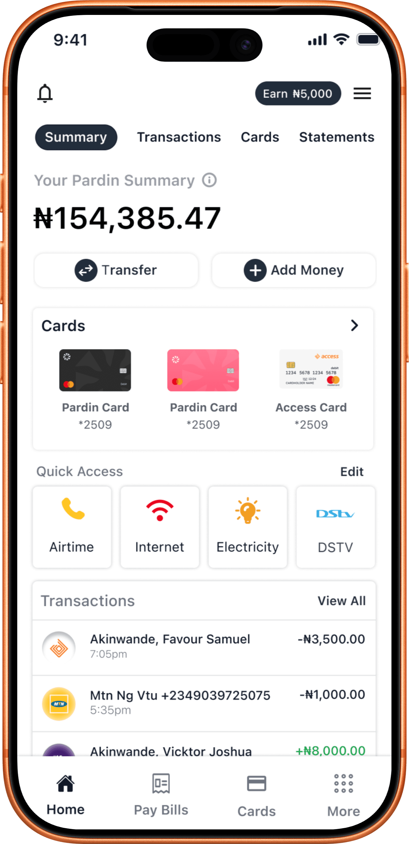
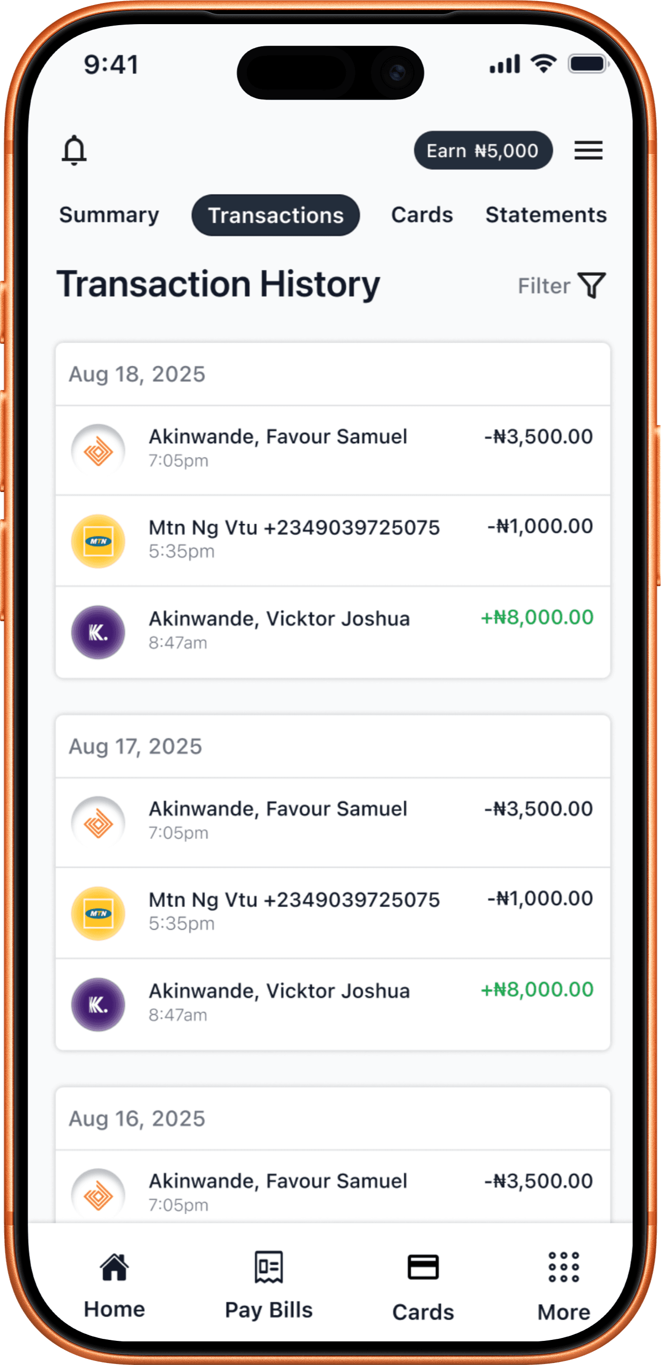
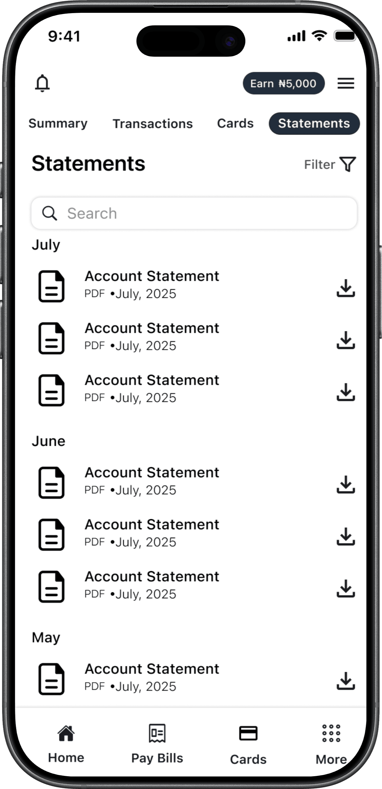
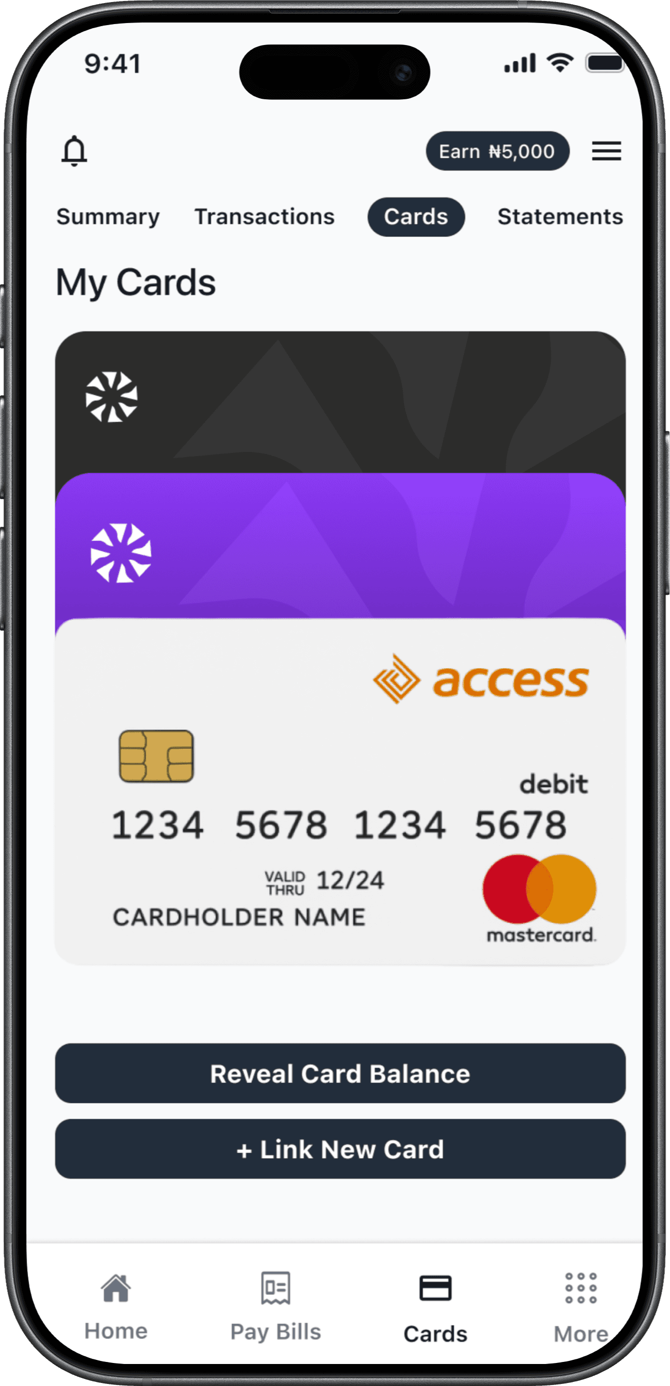
Pardin Banking App was designed as a unified digital banking solution, enabling users to link and manage multiple Nigerian bank debit cards in one place. The app provides a clean, intuitive, and accessible interface, allowing users to view their financial summaries, track transactions, manage cards, and download statements seamlessly. By focusing on minimal design, clear typography, and improved usability, Pardin simplifies digital banking and helps users gain better control over their finances.
Project Goals
The project aimed to achieve several key goals that address both user needs and business objectives:
GOAL 1: Create a unified banking experience where users can link multiple Nigerian bank debit cards in one app.
GOAL 2: Design a clean, minimal, and intuitive interface that reduces complexity in mobile banking.
GOAL 3: Improve user trust and accessibility through transparent UI and clear information hierarchy.
Sketches
The primary purpose of my sketches was brainstorming and testing ideas quickly. By visualizing different flows early, I could accelerate decision-making and identify potential issues before moving into wireframes and high-fidelity designs.

“Low-fidelity sketches of the Pardin Banking App used to validate layout choices and user flows.”
Persona
Adeyemi Samuel
(Young Professional – Lagos, Nigeria)
How this persona influenced the design:
The all-in-one dashboard was designed with Samuel in mind — giving him quick access to balances and transactions.
The card-linking feature was prioritized to reduce the pain of switching between apps.
A deep blue + white clean UI was chosen for readability and professionalism, aligning with his tech-savvy expectations.
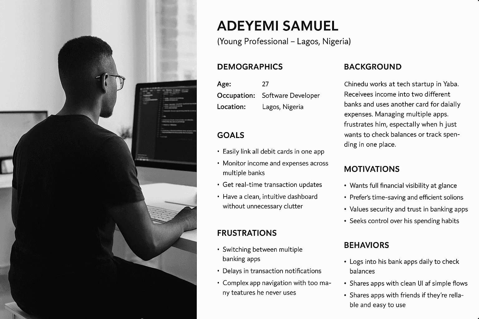
“Samuel – a young, tech-savvy professional seeking a simple, secure way to manage multiple bank accounts in one place.”
Wireframes
For Pardin Banking App, I began with low-fidelity wireframes in Figma to shape the core banking flows: summary, transactions, cards, and statements. After adding placeholder images and sample copies, the wireframes were ready for quick user testing. From 3 tests, I discovered small navigation issues around account linking and transaction visibility, which I refined through a few iterations before moving into high-fidelity prototypes.
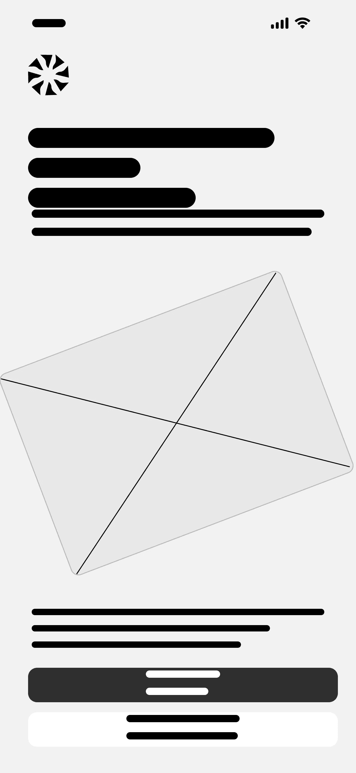
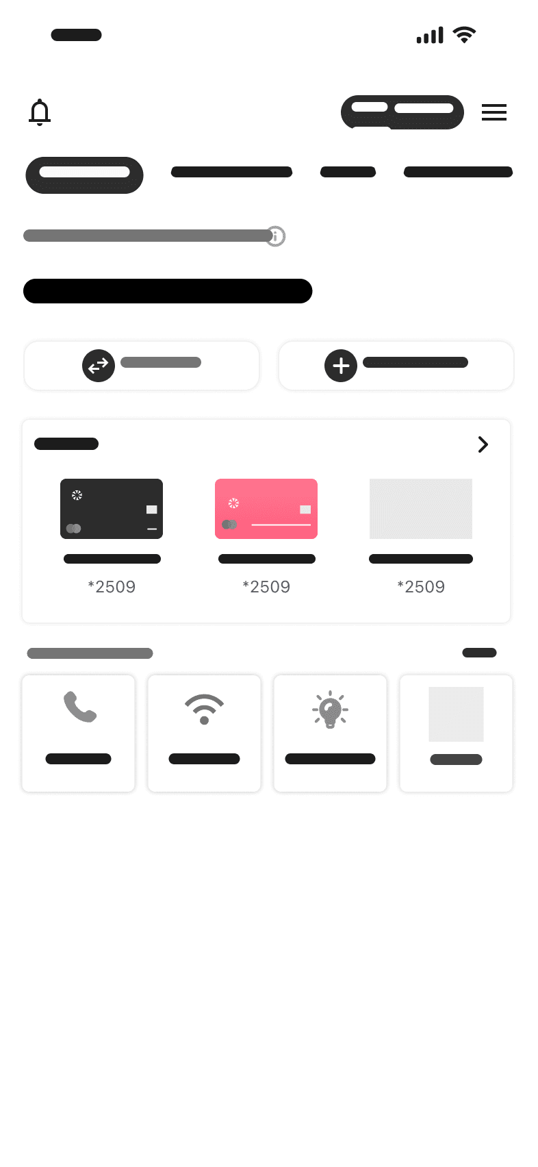
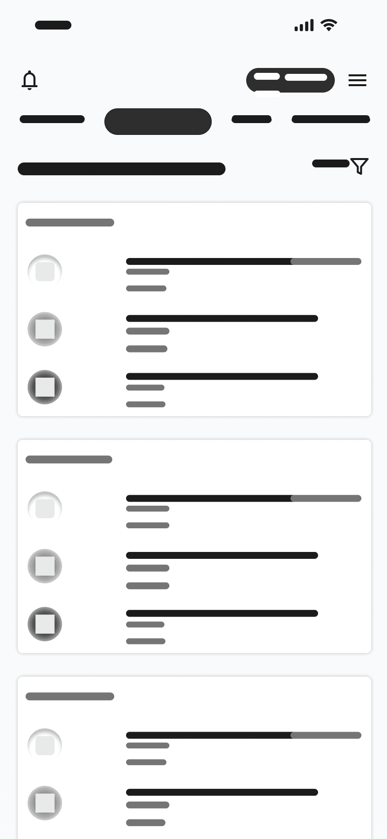
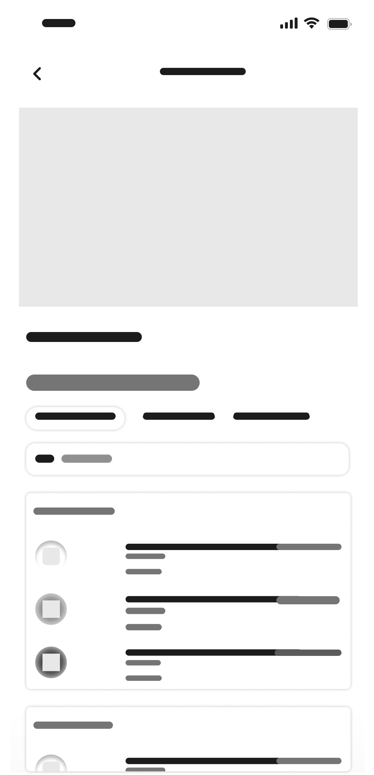

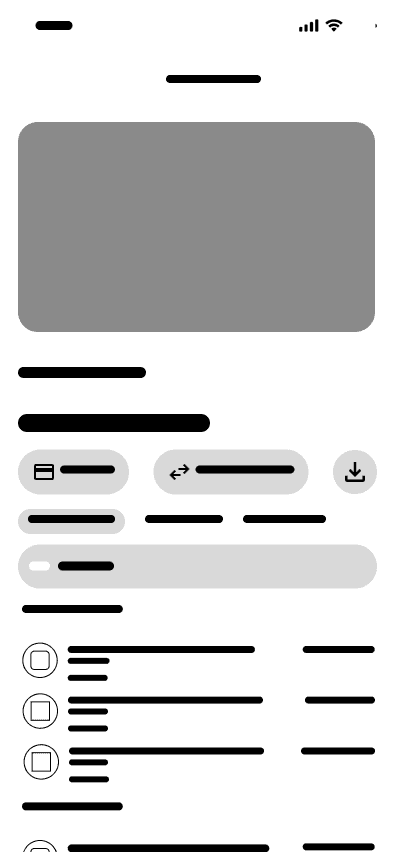

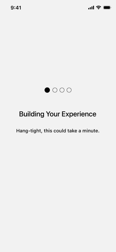
“Early wireframes in Figma helped map out Pardin’s core flows.”
UI Design
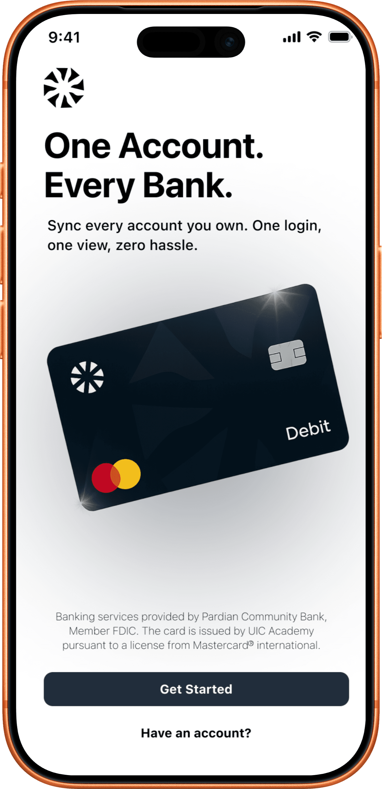
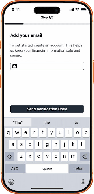
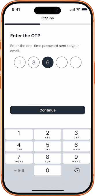
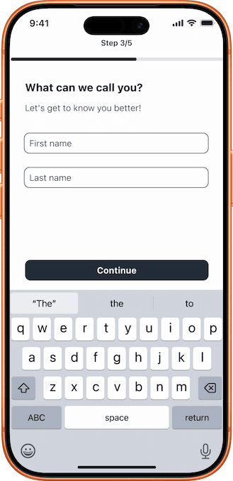
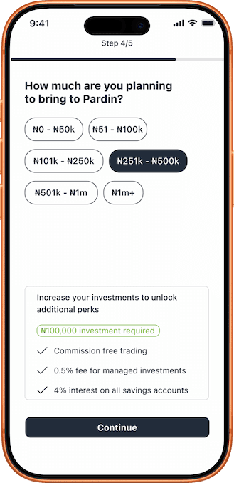
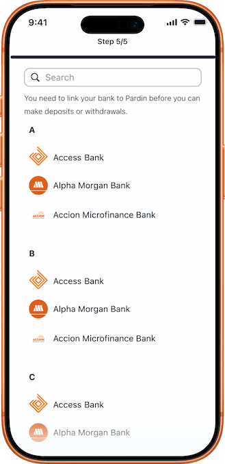
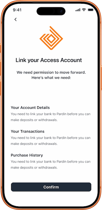
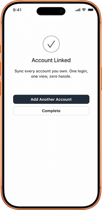
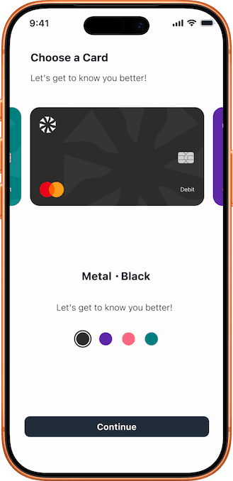
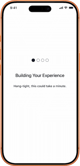
Once the usability issues were resolved, I moved on to designing the final screens in Figma. My goal was to create a clean visual identity that reflects Pardin Bank’s values: “Banking made simple, secure, and accessible.” I followed a fresh, light, and modern style with a white background and deep blue accents to convey transparency, trust, and ease of use. To ensure consistency across platforms, I drew from both Material Design and iOS guidelines, focusing mainly on mobile since most users access banking services through their phones.
 |  |  |  |
|---|---|---|---|
 |  |  |  |
 |  |  |  |
 |  |  |  |
Learnings
Simplicity & Clarity: Designed distraction-free flows that made banking easier for users.
Early Feedback: Iterating from sketches → wireframes → prototypes improved usability.
Trust & Accessibility: Used consistent colours, clear typography, and intuitive layouts.
User Focus: Samuel’s persona guided design choices to align with real needs.
Confident Usability: Prototyping validated decisions before moving to final design.
Stronger Design Thinking: Sharpened my process for presenting professional, real-world solutions.
Future Improvements
Personalized Insights: Add AI-powered spending insights and savings recommendations to help users make smarter financial decisions.
Dark Mode: Introduce a dark theme for accessibility, personalization, and better usability in low-light conditions.
Security Enhancements: Incorporate stronger fraud detection features to increase user trust.
Accessibility Improvements: Further optimize typography, contrast, and voice-assist features for users with diverse accessibility needs. A/B testing different onboarding variations to optimize further.
