
Overview
Abun is an all-in-one SEO and growth marketing platform designed to help creators, marketers, and businesses generate content, improve rankings, and scale organic traffic.
This project focused on redesigning the landing page to improve clarity, visual hierarchy, trust, and conversion while maintaining a modern, SaaS-focused aesthetic.
Problem
The original landing page, while feature-rich, presented a few challenges:
Information overload made it hard for new users to quickly understand the value
Weak hierarchy caused CTAs to compete for attention
Trust signals and testimonials were visually present but not emphasized
The layout felt dense and overwhelming for first-time visitors
As a result, users had to work too hard to understand what Abun does and how to get started.
Goals & Objectives
Improve scannability and visual hierarchy
Guide users toward primary actions (Start Free Trial)
Present features in a more digestible way
Strengthen trust using social proof and testimonials
Improve desktop and mobile readability
Clarify Abun’s value proposition above the fold
Design Approach
Visual Style:
Typography
Bold, modern sans-serif for headlines to create clarity and confidence
Clean, readable body text to support long-form scanning
Colour Palette
Deep blues and subtle gradients to convey trust, reliability, and SaaS professionalism
High-contrast CTAs to clearly guide user actions
UI Elements
Soft cards, rounded corners, and subtle shadows to reduce visual heaviness
Consistent spacing to improve rhythm and flow
Layout & Structure:
Hero Section
Clear headline explaining what Abun does
Single primary CTA (“Start Free Trial”) supported by a secondary action
Immediate trust reinforcement through brand mentions
Features Section
Grouped and simplified feature cards
Focus on benefits rather than overwhelming technical detail
Social Proof
Testimonials redesigned for better readability and credibility
Brand logos placed strategically to reinforce trust
Pricing Section
Cleaner pricing cards with clearer distinctions between plans
Reduced visual noise for easier comparison
Call to Action
Strong, repeated CTA encouraging users to take the next step
Usability Decisions:
Reduced cognitive load by simplifying content blocks
Clear CTA hierarchy (primary vs secondary actions)
Predictable layout patterns for first-time users
Improved spacing to enhance readability and focus
Every design decision aimed to make the page feel lighter, clearer, and more conversion-focused.
Responsiveness
The redesign was designed in Figma and optimized for both desktop and mobile experiences.
Desktop
Wide layout with improved content grouping
Clear top-to-bottom visual flow
Mobile
Stacked sections for smooth scrolling
Larger tap targets for CTAs
Improved text hierarchy for small screens
Initial Design (Before Redesign)
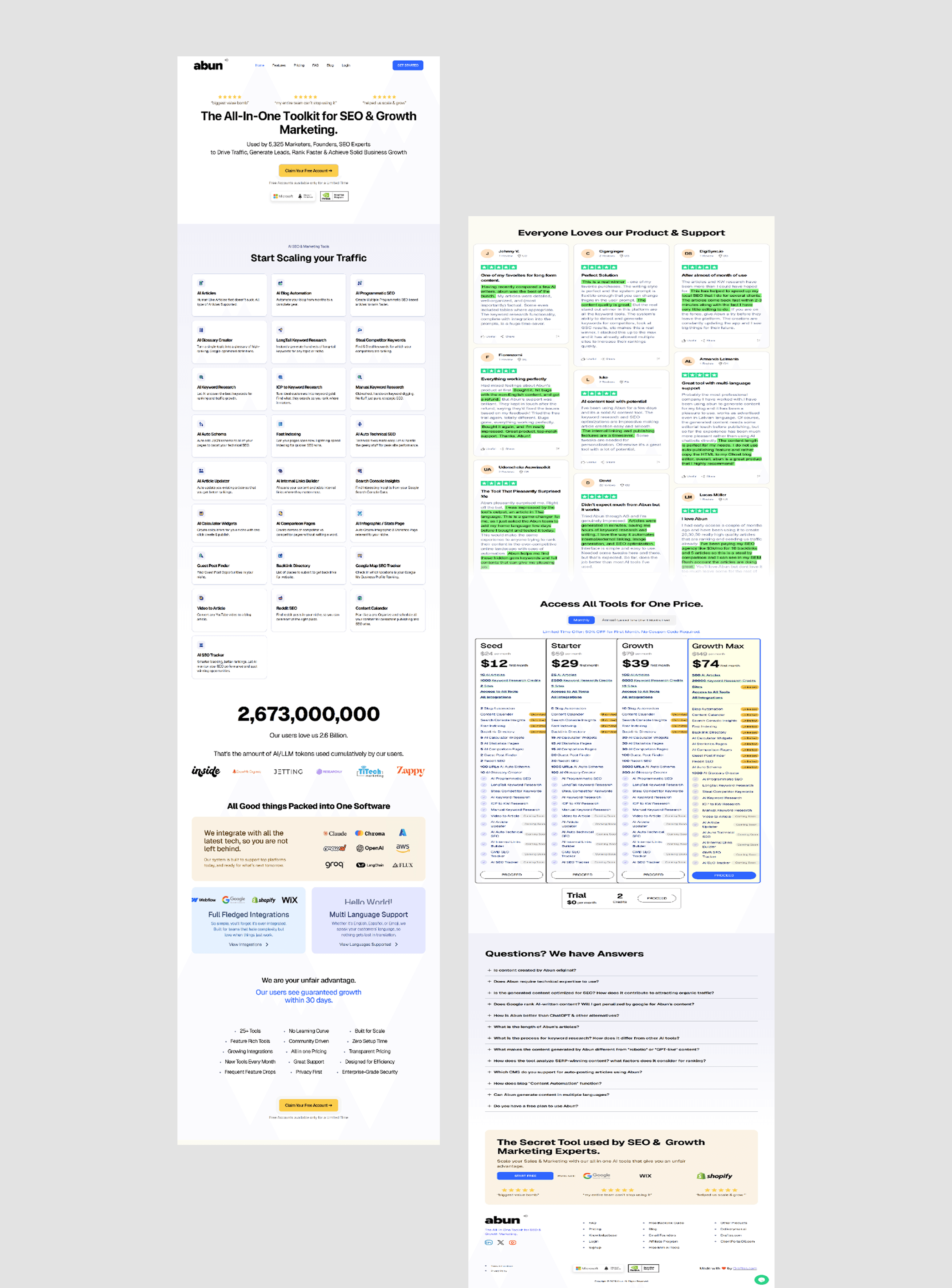
"Feature-rich but visually dense, making it difficult for first-time users to quickly understand the product’s value or identify the primary action."
What Worked
Rich feature set communicated product depth
Strong use of testimonials and pricing transparency
Established credibility through integrations and logos
What Didn’t Work
1. Overwhelming First Impression
The hero section presented too much information at once, making it difficult for first-time users to quickly understand Abun’s core value.
2. Weak Visual Hierarchy
Multiple elements competed for attention:
CTAs lacked clear priority
Feature blocks felt visually equal, reducing scannability
3. Dense Content Blocks
Large sections of information-heavy cards increased cognitive load, especially for new users unfamiliar with SEO tools.
4. Trust Signals Lacked Emphasis
Although testimonials and brand logos were present, they were visually crowded and easy to overlook.
5. Mobile Experience Felt Heavy
On smaller screens, stacked content felt long and tiring to scroll, reducing engagement.
Redesigned Landing Page (After Redesign)

"A simplified, conversion-focused layout with clearer hierarchy, stronger CTAs, and improved readability across desktop and mobile."
What Changed & Why It Works
1. Clear Value Proposition Above the Fold
The hero section was redesigned to immediately communicate:
What Abun does
Who it’s for
The primary action to take
A single, dominant CTA guides users without hesitation.
2. Stronger Visual Hierarchy
Headings clearly lead the eye
Primary actions stand out
Secondary actions are visually quieter
This makes scanning effortless and reduces decision fatigue.
3. Simplified Feature Presentation
Features are grouped and presented with:
Clear titles
Short descriptions
Consistent card layouts
This allows users to understand benefits without reading everything.
4. Enhanced Trust & Credibility
Testimonials were redesigned for readability
Brand logos are placed where users naturally look
Clean spacing increases perceived trust
The page now feels more professional and reliable.
5. Improved Responsiveness
Desktop layout feels breathable and structured
Mobile experience uses stacked sections with clear CTAs
Larger tap targets improve usability
Final Outcome
The redesigned Abun landing page delivers:
A clearer and more confident first impression
Improved feature discoverability
Stronger CTA focus
Better balance between information and visual simplicity
Overall, the redesign transforms Abun’s landing page into a more approachable, trustworthy, and conversion-driven SaaS experience.
Key Learnings
Clear hierarchy matters more than adding more content
Simplifying layouts improves both trust and usability
Strong CTAs perform better when supported by structure, not noise
Designing with responsiveness in mind prevents usability issues later
